
This page includes quick steps for loading tables and creating simple charts, as well as FAQs about charts.
For a detailed reference of properties that affect charts, see Common Properties and Chart Properties.
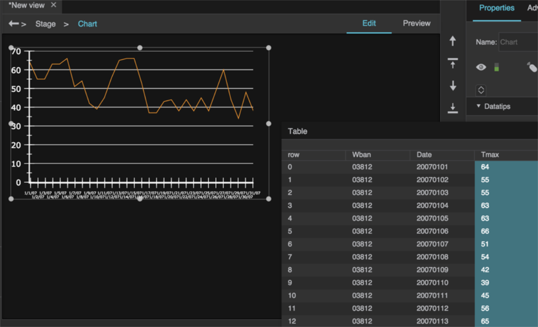
Some default chart widgets in Atrius Solution Builder
Before you can design a chart or data grid, you must load a table in the dataflow.
To load a table, follow the steps in Working with Tables.
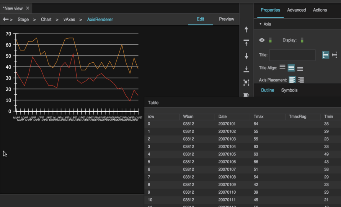
This tutorial shows you how to add series and axes to a basic chart using data in your dataflow.
To create a simple chart, take the following actions:

This task only works in Edit mode.
When you release the mouse button, a Select Axis panel appears.


Reminder: Choose the same axis types as the first series, and use values with the same units. Drop table columns into another area of the chart, not into an existing series.


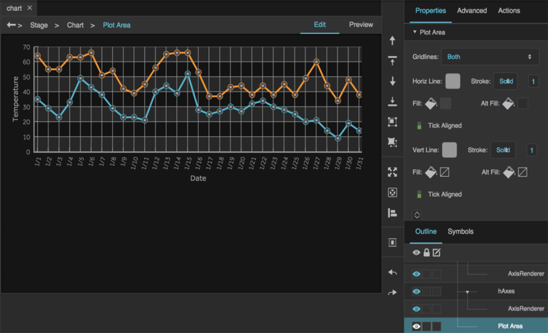
With a linear, logarithmic, or datetime axis, each series can come from a different table.
With a category axis, all series must come from the same table.
A series stacker groups multiple series that use the same axes. Within the group, series can be overlaid or stacked using the Series Stacker's Type property. Stacked series contribute to a total value, as shown in the following image.
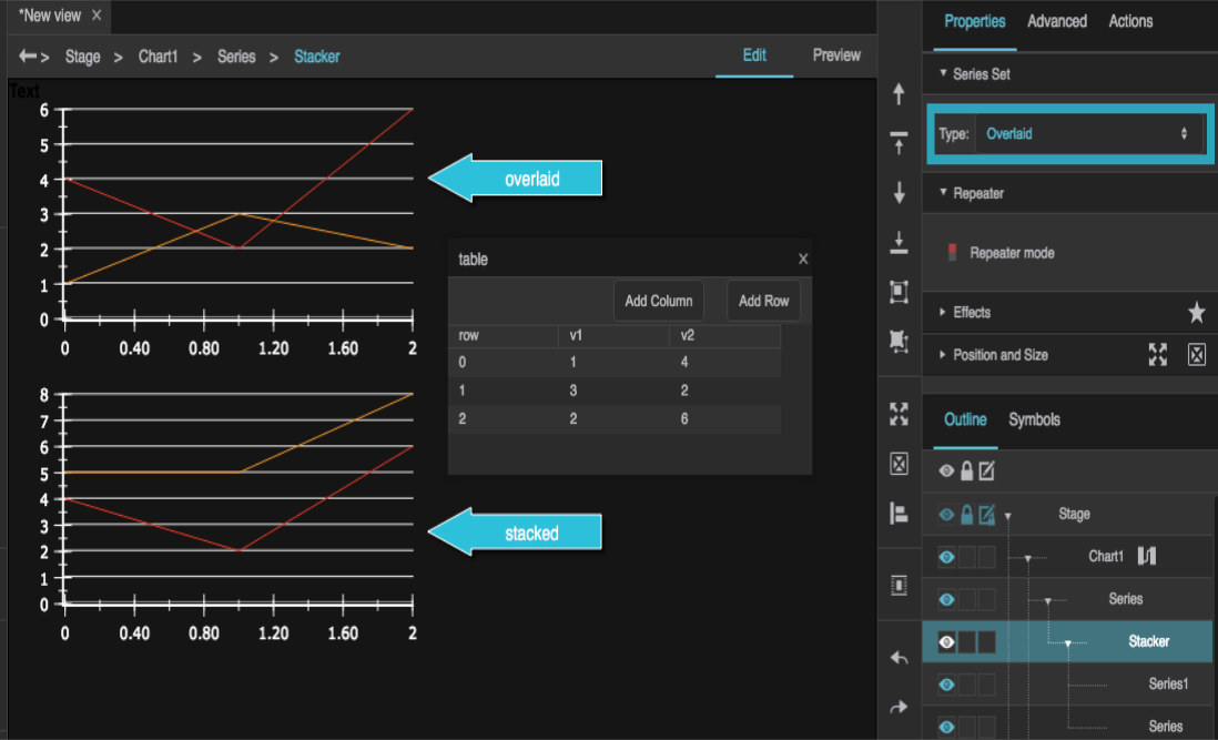
To create a series stacker, select "Multiple Series" in the Outline, then right-click the series and choose "Group".
The recorderMode property optimizes performance for line and area charts that you can update by adding a row to the end of the data and deleting a row from the beginning. In such a case, the recorderMode property causes the chart to update with reloading the unchanged values. A Realtime Recorder block with a full buffer determining the chart data is an example of this event.

An example of a chart that can use Recorder Mode.
To use Chart Recorder Mode, take the following actions:


To learn more about designing charts, go to the Charts FAQ.
Return to Atrius Developer Portal Home Page
