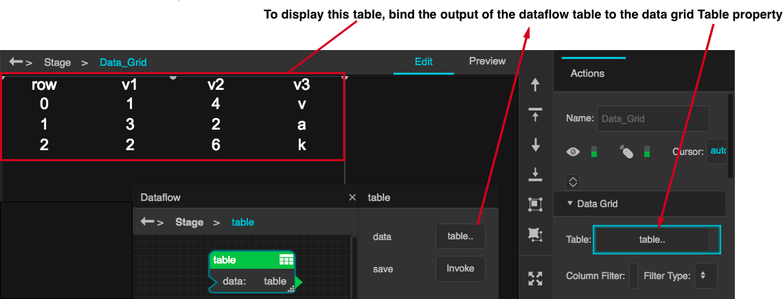
The data grid component displays data in tabular format and enables you to style, filter and sort the data that is displayed. To create a simple data grid, perform the following steps:
The stage now displays the data grid containing the sample data from the dataflow table.
To style the table, expand the data grid in the Outline, select the component you want to style, and set its properties in the properties window. To enable users to select rows, set the data grid's Selection property. To enable users to sort the table, select Column 0 and set its Sortable property to true. To configure the order in which columns are displayed, set the data grid's Filter Type property to "whitelist" and enter a comma-separated list of column names in the Column Filter property.
The following figure shows two pairs of columns grouped by category.

To group columns by category, perform the following steps:
| Column# | Selector property | Category property | Remark |
|---|---|---|---|
| 0 | Temp | (blank) | Group header for temperature |
| 1 | temp1 | Temp | First temperature column |
| 2 | temp2 | Temp | Second temperature column |
| 3 | Flow | (blank) | Group header for flow |
| 4 | flow1 | Flow | First flow column |
| 5 | flow2 | Flow | Second flow column |
By default, when you add a data grid, it contains a single column editor under its Columns node (in the Outline). The Type property for this column editor is set to "All," and any changes that you make to its properties affect all the columns displayed in the data grid.
To set properties for individual columns, set Column 0's Type property to "Name" and set its Selector property to the name of the table column containing the data you want to display in this column. To add addition columns, click the Add Columns button in the Data Grid properties section.
To dynamically create, populate, and style data grid columns, use "repeater" columns, which are configured using a table that you create in the data grid dataflow. For example, the columns in the configuration table shown below defines the contents of a data grid as follows:
You can generate the configuration table dynamically, which enables you to define a data grid that displays the incoming data without requiring advance knowledge of its structure of the incoming data. The following example shows a dataflow that generates the configuration table based on a feed of earthquake data.
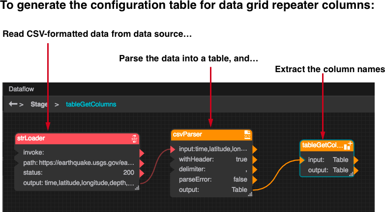
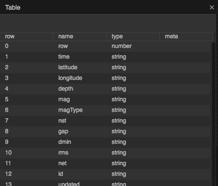
The preceding dataflow generates a list of columns that you can bind to the Data property of the data grid. To configure the table to include the header names, you must enable the withHeader property of the CSVParser block. The following figure shows the resulting configuration table.
Add the data grid, bind its Data property to the output of the csvParser block, and bind the output table of the tableGetColumns block to Column 0's Configuration Table property. To style individual columns, add logic to the dataflow to add columns to the configuration table for the desired settings and bind the columns to the settings.
 How Do I...?
Set the data grid Filter Type property to whitelist and set the Column Filter property to a comma-separated list of the columns you want to display, or set Filter Type to blacklist and set the Column Filter property to a comma-separated list of the columns that you want to exclude. To reorder the columns, use a whitelist filter.
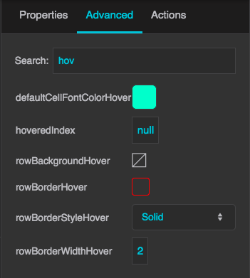
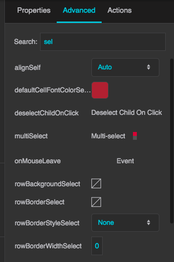
Select the data grid and, in the Advanced properties tab, set its hover-related properties as desired, as shown in the following figure:
In the Outline, select the data grid and set its Selection property to the type of selection desired: single-select, toggle-select, or multi-select. To style the selected rows, click the data grid's Rows node in the Outline, go to the Advanced properties pane, and set its selection-related properties as shown in the following figure.
To edit all of the data grid columns at once, you can use the default "Column 0" editor, which is a child of the "Column" node in the Outline. To edit individual data grid columns, perform the following steps:
Repeat steps 3–6 until you have an editor for each column.
Examples
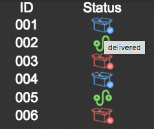
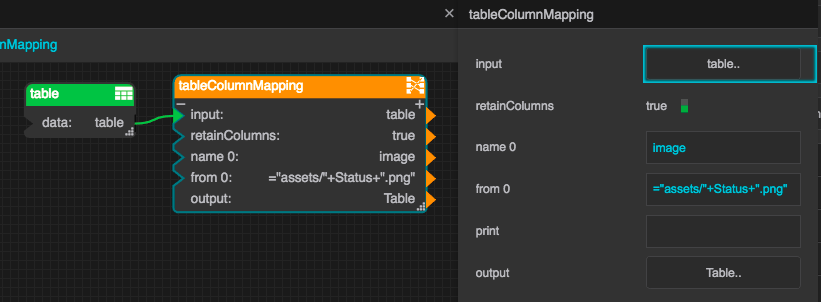
The following example uses icons to indicate the status of orders: delivered, not delivered, or en route, as shown in the figure below. In the dataflow, a column mapping block uses the status to construct the path of the image to display, and the tooltip text as well.
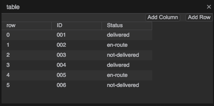
The general approach is to display a symbol that contains an image component, setting the image URL property according to the status of the item in the table row. The example assumes that your assets folder contains the following images:
To implement this example, perform the following steps:
If you have configured the example correctly, the datagrid displays the images corresponding to the order status for each table row.
Return to Atrius Developer Portal Home Page